 | | | | | | | |
| Olaf Nicolai’s installation for the exhibition Museotopia, Karl Ernst Osthaus-Museum, Hagen. Screen shot. |
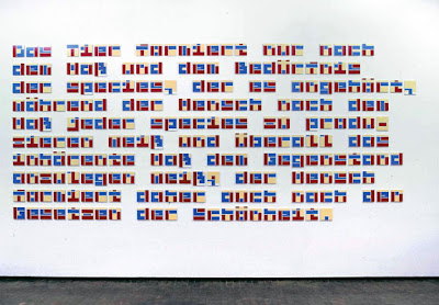
Berlin-based artist Olaf Nicolai commissioned Stephan Müller in 2002
to design a typeface for the exhibition Museutopia in the
Karl Ernst Osthaus-Museum, Hagen (Germany), which focused on the theme of Utopia.
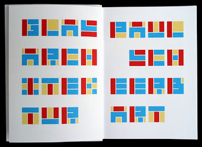
The result was 'Nikolai'; an alphabet based on a simple square, employing the principle of layering. Through combining the three available layers, the actual type is constructed.
The alphabet was used in the exhibition for the reissue of a utopian architectural essay («Glasarchitektur» by Paul Scheerbart) and to decorate a wall with a quotation from Karl Marx. 'Nicolai', comes in two different shapes: as a set of three fonts (one for each layer), and as a Shockwave application, programmed by Jürg Lehni, which allows changing the colours of each layer easily.
 |
| Screen shot. |
Read more about this
here.
Launch Shockwave application here.
In my view, even though I find this project very interesting in terms of its idea; curating; design etc; I am not sure how this alphabet is linked intellectually or conceptually with the theme of utopia.
Nikos Georgopoulos


