Wednesday 22 August 2012

Nikos Georgopoulos, Research project submission / Unit 2 assessment (posted on 23/8/12)

My research project at Camberwell College of Arts is an enquiry into the concept of self-awareness -a state that one can gradually acquire through a journey of self-exploration. More specifically, the aim of this research is about communicating as well as exploring how such a concept translates into real life.

Some of the submitted work is included on the Degree show (noted here as included) and some of it isn't (noted here as not included). Yet, every project I am attaching hereto is to be considered as work elaborated within the Unit 2 and submitted in order to be assessed.

02. June 14, 2012 / web site (not included).
03. June 14, 2012 / catalogue (included).
04. June 14, 2012 / 3min. video (not included)
07. Invitation to a voyage / identity photographs -blog (included).
08. Written paper
09. Reflective Journal 
10. Blog


Nikos Georgopoulos,
London
August 2012

Research Project, 'Invitation to a voyage', participatory installation (posted on 22/8/12)

'Invitation to a voyage', interactive installation / mixed media; dimensions variable. Photo by N. Georgopoulos.


Invitation to a voyage represents the final outcome of my research project and it is designed on the occasion of Camberwell College of Arts' MA Visual Arts 2012 Degree show. For the purpose of the Postgraduate Summer show, I revisited June 14, 2012 and decided to re-exhibit it or to re-run it if you like -since this project is based on people's participation and therefore it is a performance. On the basis that on June 14th the event was considered to be a success, I kept all the elements that worked and abolished any aspect of the project that did not work or I considered it to be unnecessary. What is more, because the context within which the installation has to work now is not as much time specific as it was on the 14th of June, but it is an Art School's 14-days period degree show I did the following:

1. Changed the title from June 14, 2012 -which is something time specific- to Invitation to a voyage -which is something more coherent and basic, that refers more directly to the concept of an existential journey and that is conceptually flexible enough so as to allow to the installation's framework to fit into a 1-day period exhibition scheme, 1-week, 2-weeks and so forth.

2. Instead of using a ready-made but still D.I.Y photo booth -as I did the previous time, I designed/constructed a physical manifestation that refers to the concept of a photo booth. By doing so, I could control the overall aesthetics and visual language of the installation as opposed to the other way round. What is more, even though it required more work that it would require if I were hiring a booth, it kept the cost considerably cheaper and my stress levels normal.

3. Instead of contacting the participants after the installation in order to interview them as I did for the June 14, 2012 catalogue, I came up with the flexible solution of the exhibition book -archive if you like, which is realised by a ready-made green Ring Binder carrying A4 photocopied writing forms. That said, participants could use them for completing the exact date of their performance -from the 5th of Sept. - 13th, the object that they chose as well as the reason why they considered that particular object a personal point of reference to who they are. In that respect, the interview is live, the writing is live and every 'element' contributes to the overall synthesis.

4. Because the visual framework of a degree show is more dominant than the framework of an individual project I did not have to design a web site. In that respect, I set up a tublr -an online platform that behaves as an online journal- and every day I am going to post the identity photographs of the people who participate in the performance.

In conclusion, my Degree show project is designed so that it can be considered as a workshop; performance; interactive installation; event within an event and so forth. All of the above are important and relevant because they presuppose their experience.

'Invitation to a voyage', exhibition book / green ring binder; photocopied paper; 21x29.7cm. Photo by N. Georgopoulos.   


'Invitation to a voyage', exhibition book / green ring binder; photocopied paper; 21x29.7cm. Photo by N. Georgopoulos. 

'Invitation to a voyage', exhibition book / green ring binder; photocopied paper; 21x29.7cm. Photo by N. Georgopoulos. 

'Invitation to a voyage', installation's spatial study.  Design by N. Georgopoulos. 


'Invitation to a voyage', composition process. Photo by Elaine Zhang. 


'Invitation to a voyage', composition process. Photo by Elaine Zhang. 
'Invitation to a voyage', preparatory drawings. Photo by N. Georgopoulos. 
'Invitation to a voyage', construction. Photo by N. Georgopoulos. 

Tuesday 21 August 2012

Research Project, 'June 14, 2012', Catalogue (posted on 21/8/12)

'June 14, 2012', Catalogue. Photo: N. Georgopoulos.


The current publication has been designed as a follow up of the participatory installation June 14, 2012. The purpose for its production was to feature the participants' interviews -elaborating on why they chose a particular object- as well as the Identity photographs that they took while 'traversing' a metaphorical itinerary -suggested before them via the conceptual context of the Installation.

The design of the catalogue is inspired by the concept of Archiving within visual culture as well as by Year-books. The idea that its function is to include the aforementioned issues as a sequel of the context within which they have been produced (June 14, 2012) is deliberate and aims at reinforcing the concept of a journey.

The overall typographic approach of June 14, 2012 draws inspiration by bureaucratic documents and archival systems, hence the use of Times New Roman and Courier New as the official typefaces of the project. Times New Roman is considered to be a default typeface used for announcements posted within the context of a public service while Courier  is a contemporary digital version of the letters of a typewriter -a medium that is inextricably linked with the concept of Archiving.

'June 14, 2012', Catalogue. Photo: N. Georgopoulos.


'June 14, 2012', Catalogue. Photo: N. Georgopoulos.


'June 14, 2012', Catalogue. Photo: N. Georgopoulos.
'June 14, 2012', Catalogue, 'Identity Photographs'. Photo: N. Georgopoulos.


'June 14, 2012', Catalogue, 'Interviews'. Photo: N. Georgopoulos.

'June 14, 2012', Catalogue, 'objects'. Photo: N. Georgopoulos.

'June 14, 2012', Catalogue, 'objects'. Photo: N. Georgopoulos.


Number of pages: 160 
Publication size: 20x27cm 
Paper Stock: Munken Pure 240gsm; Munken Pure 70 gsm; Blue glossy paper (ATH-GR); Magazine paper. 
Typefaces: Times New Roman; Courier New. 
Printed by: Online Reprographics; Thames Barrier Print Studio. 
Book binding by: Wyvern Bindery (Clerkenwell Road).


Nikos Georgopoulos
London,
August 2012.

Thursday 16 August 2012

Sara Cwynar, 'Accidental Archives', exhibition project, 2012. (posted on 16/8/12)

Sara Cwynar, 'Accidental Archives', 2012. Cooper Cole Gallery, Toronto.


Sara Cwynar (Vancouver, 1985) is a New York-based Graphic Designer and artist working in photography, book-making and digital media. She studied Graphic Design and Photography at York University and English at the University of British Columbia.

Having previously worked on the New York Times re-design she launched Accidental Archives, a personal project through which she ''... explores all the junk and souvenirs and photos we accumulate... also the collective body of photographs we see and understand in our culture.” Clearly influenced by the concept of Archiving within visual culture, she uses objects that she has been accumulating over the course of the past decade, she sorts them out by colour and photograph them as beautiful syntheses, producing thus, a series of somewhat eerie Still Lifes.

Cwynar's project is on show at the Cooper Cole Gallery in Toronto until the 18th of August, 2012. See more for this project here.


Nikos,
London
August 2012

Wednesday 8 August 2012

Truce. (posted on 8/8/12)


LONDON 2012, Olympic Logo. Designed by Wolff Olins. Print screen.

Klute, Typeface, 1997. Designed by Alias. Print screen.


LONDON 2012, Typeface. Designed by Alias. Print screen.


LONDON 2012, Tickets. Designed by ---. Print screen.


ATHENS 2004, Logo. Designed by Red Design Consultants. Print screen.


Sydney 2000, Logo. Designed by ---. Print screen.

Beijing 2008, Logo. Designed by ---. Print screen.

Mexico 1968, Logo. Designed by Lance Wyman. Print screen.

Munich 1972, Event(-ually)'Logo'. Print screen.

Munich 1972, Pass. Print screen.

Wednesday 18 July 2012

'Thursday 10.00 Tate Britain‏' (posted on 18/7/12)

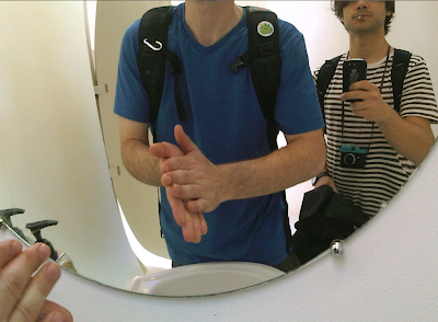
Camberwell College of Arts' MA Graphics students Dylan (left) and Nikos (right)
at Sketch's toilets. Photo by N. Georgopoulos


Last Thursday (12/7) we did a very interesting full day Gallery tour in London starting from Tate Britain at 10.00 in the morning as part of our final show research and planning. The tour included: Patrick Keiler's exhibition at Tate Britain; Bruce Nauman's sound installation at the ICA; a retrospective by Jenny Holger; a stencil by Banksy painted on an alley; a visit at a sort of conceptual restaurant called Sketch (photograph). The second half of the itinerary was spent at Antony Pearce's studio (fellow student at Camberwell) as well as visiting 2 exhibitions held at Victoria Miro.

Personally, I was much more interested in the environments within which the exhibitions were carried out rather than the exhibitions themselves. In particular, I was mesmerized by Victoria Miro both interior as well as exterior space. What is more, the most impressive thing was Sketch's futuristic Clockwork orange-inspired toilets (photo). Having said that though, I have to say that I was highly intrigued by Patrick Keiler's sort of 'weird' concept for his exhibition, which was about displaying his own work in conjunction with other pieces from the Tate collection. An endeavour that approached narrative in a very interesting way -I think.

Nikos Georgopoulos,
London,
July 12

Saturday 14 July 2012

'Studio culture' at the Design Museum. (posted on 14/7/12)

Unit Editions: 'Studio Culture', Design Museum, London, 2012. Spin design studio (Patricia Finegan & Tony Brook) interviewed by Adrian Shaughnessy (left). Photo by N. Georgopoulos.


Last Friday I attended Unit editions' Studio Culture book re-launch at London's Design Museum as part of its ongoing series Design Museum Takeover. Unit Editions, an independent publishing company, has been brought into life when Tony Brook (Spin) and Andrian Shaughnessy (Graphic Design on the radio) joined forces with the intention to produce research papers and affordable books about Graphic Design and Visual culture.

The event was called Studio Culture and it was about ''the secret life of Graphic Design Studios''. Five London based studios were invited to chat with and answer questions put by Andrian Shaughnessy and the public in relation to the culture they cultivate amongst their work spaces, etc as well as on current design and sociopolitical issues. Brook pointed out at the beginning of the afternoon that ''.. this event is only going to work if you make lots of intimate questions to the designers; cause quite frankly, you ain't gonna get this chance again for a long time''. During the event Unit Editions' book Studio Culture was available for purchase via the Design Museum shop in half price.

In my view, the event was fantastic. Not only it did work very well in conjunction to the theme of the book and therefore, it worked very good as a promotional scheme,  but it also gave the chance to the attendees (design students, graduates, recent graduates and so on) to chat and get to know some of the most successful and world acclaimed European graphic designers. So, massive thanks to Unit Editions as well as to the Design Museum which usually, is not even affordable -sorry, but you got to tell it like it is.

Nikos Georgopoulos
London,
July 12

Friday 13 July 2012

Metahaven, 'Signal (Murcia)', installation, 2010. (posted on 13/7/12)

Metahaven, 'Signal Murcia', installation at the former Post Office, Murcia
(ACAF), Manifesta 8, 2010. Original photo by Ilya Rabinovich. Print screen.


Metahaven is a studio ''for design and research'' based in Amsterdam. Founded in 2007 by Vinca Kruk and Daniel van der Velden, their work -both commissioned and self-directed- focuses on identity while reflecting political and social issues through its provocative graphic design schemes. Amongst the studio's research projects are the Sealand Identity Project as well as the celebrated Uncorporate Identity (Lars Müller, 2010), a self-initiated book on politics and visual identity.

In 2010, Metahaven were invited to participate in Manifesta 8, Murcia, Spain. Perhaps, in order to gain a deeper understanding of the concept that Metahaven came up with for their Manifesta project we should take into consideration that Murcia is a very important region for the European fruit and vegetable market. Having said that though, some of the production -eg. lemons- has moved to Northern Africa or even to other places outside Europe. The issue of Manifesta 8 was suggestively titled to be “in dialogue with Northern Africa.”

Through an interview taken by the Highlights, an online art journal, Metahaven observe that ''... fruit has an origin. From that origin it travels in a network, between nodes of distribution, until it ends up at the place where it is eaten.''[1] The designers came up with a fruit-market installation -with fresh fruit provided by a cooperative of organic farmers who run a self-managed business, exporting throughout Spain and to some other European countries.  As a project, Signal (Murcia) is considered to be an alternative labeling system for the fruits; one that is based less on the characteristics of the product but more on the sociopolitical situation of the place they have been produced at. Through the same interview, Metahaven pointed out that they ''.. love fruit labels as devices that contain information, ideas, and dreams... Unlike packaging, fruit labels do not overshadow the product. Often, all they do is convey the origin or name of the fruit, as well as a certain atmosphere... ''.[2]

To sum up, Kruk and van der Velden ''.. are interested to voluntarily approach the constraints of commissioned design, while operating in an art context...''.[3] And I suppose that by now, the seemingly weird title  -Signal (Murcia)- just started to make some sense. 

Metahaven, 'Signal Murcia', installation at the former Post Office, Murcia
(ACAF), Manifesta 8, 2010. Original photo by Ilya Rabinovich. Print screen.


Notes:
1, 2, 3. The Highlights.org ‘Interview with Metahaven’
< http://thehighlights.org/wp/interview-with-metahaven> [Accessed on 25.07.12]


Nikos Georgopoulos
London,
July 12

Tuesday 10 July 2012

'Bauhaus: Art as Life', Barbican Art Gallery (posted on 10/7/12)

Print screen


A couple of weeks ago I visited the celebrated Bauhaus: Art as Life exhibition at the Barbican Art Gallery. As the name might state the obvious, the whole exhibition was about the Bauhaus movement; a movement that what we call design is rooted there.

The show was massive -and perhaps too much, as it presents Bauhaus from its very first endeavors in form and color followed by furniture, catalogues, sculptures, architecture and so on, up to the last photograph that was shot in the school's canteen the day that it became past.  In conclusion, it was a very well curated show, very large and multi disciplinary ranging from linoleums and typography to furniture and photography. It's not that the informed viewer will see something new, but perhaps they will be able to observe a sequence of evolution that was trigured and gradually shaped contemporary visual culture. The exhibition will be on public display until August 12th, 2012.


Nikos Georgopoulos
London,
July 12

MA Symposium No2 (posted on 10/7/12)

Photo by N. Georgopoulos


There is something about presenting your work which is exciting. For me, presenting my work is simmilar to a gig -you go on stage and you perform live! You give your best performance in order to communicate as good as you have imagined.

Towards the end of June of 2012, every student from MA Graphics (including the author) gave a 10 minutes presentation about their work followed by another 10 minutes Q&A at the Ceramics lecture theatre at Camberwell College of Arts. Overall, it went very good. As far as concerns me as a researcher/designer at Camberwell, it was exciting and surely something I needed to do because I had just finished the first part of my project (June 14, 2012) and felt the need to present it as a whole, as a sequence -because that was the way I had conceived it.

My father always tells me that apart from the apparent benefits that one gains when presenting their work, the real and most essential value they get out of their presentation is that of the preparation.


Nikos Georgopoulos,
London,
July 12

Camberwell College of Arts summer show (posted on 10/7/12)

Photo by N. Georgopoulos


Congradulations to all of the Camberwell College of Arts' BA students who exhibited their work on the 16th of June at the 2012 summer show. I tryed to see most of the work but couldn't due to hardcore MA work. From what I saw though, I felt really proud to be part of this famous London-based academic institution. BA Photography, BA Sculpture and BA Illustration had some absolutely mesmerizing projects! Well done!


Nikos Georgopoulos,
London,
July 12

Damon Albarn & Rufus Norris, 'Dr. Dee', opera (posted on 10/7/12)

Damon Albarn at a rehearsal for 'Doctor Dee'. Photo by Jonny Donovan. Print screen.

British Design 1948-2012, V&A (posted on 10/7/12)

Print screen

Saturday 7 July 2012

Research Project, 'June 14, 2012', web site (posted on 7/7/12)

'June 14, 2012', home page. Web Site.


This website was designed in order to host the Identity pictures that the participants of the Installation took inside the photo booth. Since printing the pictures instantly during the event was not an eligible thing to do -from a budget perspective- I designed a website where people could visit so as to download their pictures instead of posting them on a Facebook event page or on Flickr -something that could destruct them from the project to some degree or another.

On that basis, I applied the same sort of design approach with the intention to create a consistent identity for the whole project. What is more, designing a bespoke space for an event in order to 'place' the photographs that were taken during its context, is something that provides to the participants a reassurance that their pictures are not distributed irresponsibly around the web nor they are posted to a free, and therefore dodgy platform.

'June 14, 2012', photographs. Web Site.


'June 14, 2012', Web Site. Design specifications.

'June 14, 2012', Web Site. Design specifications.


Art Direction & Design: Nikos Georgopoulos
Coding: Thodoris Tsiorkas
URL: http://14-6-12.com


Nikos Georgopoulos
London,
June 2012

Research Project, 'June 14, 2012', participatory installation (posted on 7/7/12)

'June 14, 2012', participatory installation. Photo by N. Georgopoulos.


My research project at Camberwell College of Arts is an enquiry into the concept of self-awareness -a state that one can gradually acquire through a journey of self-exploration. More specifically, the aim of this research is about communicating as well as exploring how such a concept translates into real life.

After a lot of research and tests, I came up with the idea to communicate a particular state (destination) through a synthesis (journey). On the basis that self-awareness presupposes experience, the project culminated on June 14th, 2012, into an interactive installation of the same name, consisting of a ready-made bookshelf (containing objects-symbols) and of a photo booth (mixed media) -symbolising respectively the concept of (our) background and that of identity. People were invited to choose an object from the bookshelf that they could identify as a point of reference to who they are; and to take an identity photograph with that object by using the photo booth –essentially communicating that; in real life, people ‘acquire’ their identity by becoming aware of themselves.

The id photographs as well as the interviews of the participants regarding their choice of object will be included into a year book-like catalogue which I am currently designing and will display at the Final show in September.
'June 14, 2012', participatory installation. Photo by N. Georgopoulos.

'June 14, 2012', participatory installation. Photo by N. Georgopoulos.

'14-6-12, How to participate', installation hand in. Photo by N. Georgopoulos.

'June 14, 2012', participatory installation. Photo by N. Georgopoulos.

'June 14, 2012', installation set up. Photo by Ch. Iosifides.

'June 14, 2012', preparatory sketches by N. Georgopoulos.

'June 14, 2012', photo booth construction in collaboration with Dylan Frazao. Photo by N. Georgopoulos

'June 14, 2012', spatial study by N. Georgopoulos.

'June 14, 2012', preparatory sketches by N. Georgopoulos.

'June 14, 2012', spatial study by N. Georgopoulos.