 |
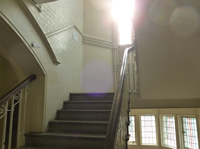
| Camberwell College of Arts, Peckam site, UAL, London. Photo: Nikos Georgopoulos |
The term Site-Specific Art refers to an artwork that is conceived and created to exist in a certain place; which means that the artist takes the location into account -in terms of its physical manifestation as well as its contemporary and historical context- while planning and creating the artwork. The location is linked to the idea as well as to the artwork itself.
Established in 1898,
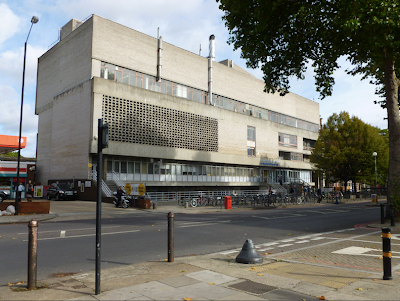
Camberwell College of Arts is a constituent college of the University of the Arts, London, and is widely regarded as one of the world's most prestigious and foremost art and design institutions. It is located in Camberwell, South London, England, with two sites situated at Peckham Road and Wilson Road. Originally, the College offered classes in practices such as, Architecture; Stencil cutting as well as others, and by 1920 a Fine Art Department had been created. Today, the College is quite famous for disciplines related to visual culture; ranging from Fine Art and Sculpture to Graphic Design and Illustration. In addition to this, it is very well known for its arty; sort of 'rough' and slightly underground; socially engaged; intellectual approach towards its disciplines.
As far as concerns the area within which the College is located, South London is a very interesting and vibrant area that reminds me slightly the set as well as the photography and the aesthetics of Massive Attacks' video-clip of their song
'Unfinished Sympathy' (Blue Lines, 1991, Virgin Records); which simply consists of one continuous shot of Nelson walking along a sidewalk. In particular, there are many design studios and artists concentrated in this part of London and as
David Cross, artist himself and Course Director of the MA Graphics on Camberwell, points out; 'many artists and designers -particularly those who have been through Camberwell- have helped define the character of this area' and vice versa. What is more, the accommodation in this area is cheaper than other parts of London. Long story short, South London is 'arty', sort of 'rough' and 'underground' in terms of aesthetics as well as socially engaged -partly because of the people who live and operate there.
 |
| Massive Attack, Unfinished Sympathy. Music video, Virgin Records, 1991. Directed by Baillie Walsh. Screen shot. |
 |
| Camberwell College of Arts, Peckam site, UAL, London. Photo: Nikos Georgopoulos |
In my view, the way in which Camberwell College of Arts' approach on art and design education is linked with its -architectural, sociological and cultural- environment, consists an overall experience that is site-specific; therefore, unique. And the same applies to every University; College or School -anywhere around the world really, that seems to update their ideas and approach on education with what's happening in the world right now. So, in that sense, the 'location' is linked to the idea as well as to the 'artwork' itself.
Nikos Georgopoulos,
26th of October, 2011
Islington,
London


